

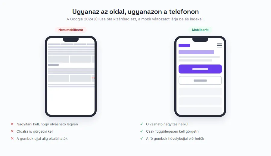
If you search for “Google mobile-friendly test” today, you will find dead links. At the end of 2023, Google retired both its Mobile-Friendly Test and the Mobile Usability report in Search Console. Many people conclude from this that the topic no longer matters.
The truth is exactly the opposite. Google removed the separate report because mobile has since become the default: since the summer of 2024, it works exclusively with your mobile version. It is no longer a separate checkbox - it is the starting point.
In this article we will walk through what mobile-friendly actually means, what to test with now that the old tool is gone, what the most common mistakes are, how big a button should be, and how to check all of it in ten minutes on your own phone.
It gets decided on mobile, and that is how Google sees it too
Let us start with the Hungarian numbers. According to the NMHH 2025 household survey, 96% of Hungarian internet users go online on a smartphone, compared with 73% on a laptop and 52% on a desktop computer. The average daily time online is 4.7 hours, and most of it is spent on a phone.
Google has adjusted how it works accordingly, and permanently. Mobile-first indexing was completed on July 5, 2024: since then, Google crawls and indexes websites exclusively with its mobile Googlebot. Their own announcement is unambiguous: content that is not accessible from a mobile device will not be indexed.
This has a consequence that many people never think through. It is not just about your site “looking good” on a phone. It is about the fact that whatever is missing on mobile does not exist for Google either. If an old template hides a text block or an entire section on small screens, that content will never show up for you in search results.
This is the most common hidden flaw on older sites: everything is there on desktop, half of it on mobile, and nobody understands why Google cannot find them for phrases that are “right there on the page”.
What exactly does mobile-friendly mean?
In practice there are three approaches, and only one of them is good.
A responsive site. One HTML page, one address, and the layout adapts to the screen size: columns stack under each other, the menu becomes a hamburger menu, the text stays readable. This is the default today, and it is what Google recommends, because it only has to index a single URL.
A separate mobile site (the old m.yourdomain.com style solution). Once common, now obsolete: you have to maintain two sets of content, they drift apart easily, and since mobile-first indexing was completed, it makes no sense at all.
Nothing, meaning a fixed-width desktop site. The phone browser shrinks the whole thing down, and visitors have to pinch-zoom and scroll sideways. Today that is not “old-fashioned” - it is unusable.
One important clarification: responsive is not the same as mobile-friendly. Responsive is the technique, mobile-friendly is the result. A site can be technically responsive while its buttons are too small, its text is tiny, and the most important information sits three screens down. That is still not mobile-friendly.
How do you test now that Google's test is gone?
Let us clarify exactly what was retired. On December 1, 2023, Google withdrew the Mobile Usability report in Search Console, the Mobile-Friendly Test tool, and its API. The reasoning: several other, better tools have become available since, such as Chrome's Lighthouse.
What remains is actually more, and more accurate. The mobile view of PageSpeed Insights gives you usability signals alongside speed. With the device emulator in Chrome DevTools (press F12, then the device icon) you can try out any screen size. And Lighthouse runs a full audit, including font size and the viewport setting.
And there is one method worth more than all of them: your own phone, on mobile data, with wifi turned off. No emulator can reproduce what it feels like to use your site with a thumb on a moving tram. At the end of this article we give you a ten-point self-test for exactly that.
If speed matters to you as well, we covered it separately: why your website is slow.
The most common mobile mistakes
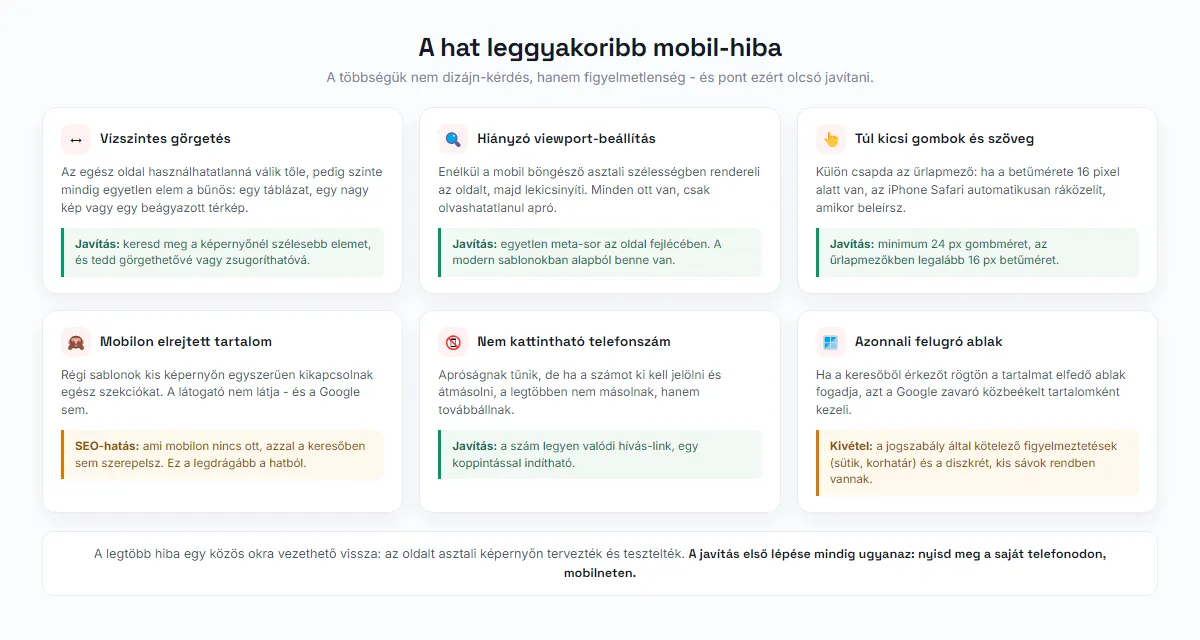
The mistakes repeat surprisingly often, and most of them are not design problems - they are oversights.
Horizontal scrolling. The most common symptom. It is almost always caused by a single element that is wider than the screen: a table, a large image, an embedded map or video. It makes the whole page unusable, even though one element is to blame.
A missing viewport setting. If the proper meta line is missing from the page header, the mobile browser renders the page at desktop width and then shrinks it all down. That is the classic experience where everything is there, just unreadably small.
Text that is too small and buttons that are too tiny. More on that in a moment. Form field font size is a trap of its own: if it is smaller than 16 pixels, iPhone Safari automatically zooms in on the field as you type. To the visitor, it feels like “the page keeps jumping around”.
Content hidden on mobile. Older templates often simply switch off sections on small screens. Today that is both a usability and an SEO mistake, because Google only sees the mobile version.
A phone number that is not tappable. It seems like a small thing, yet it is one of the most expensive mistakes: if the number cannot be called with a single tap, the visitor has to select and copy it. Most people do not copy - they leave.
Your finger is not a mouse pointer
The tip of a mouse pointer hits a target with pixel precision. The contact area of a fingertip is huge by comparison, and on top of that it covers the very thing it is pointing at. That is why minimum target sizes exist.
The web accessibility standard (WCAG 2.2) requires at least 24x24 CSS pixels for clickable and tappable elements at level AA, and 44x44 pixels at level AAA. The platforms' own guidelines are even more generous: Apple recommends 44x44 points, Google's Material Design 48x48 units.
The practical rule that follows: 24 pixels is the floor everywhere, and 44-48 pixels for your main buttons. For links within running text the standard does not require a minimum size - there, line spacing and text size are what matter.
Spacing matters at least as much. Even two buttons that are big enough on their own get mis-tapped constantly when they are crammed together with no room between them. Menu items, footer links and filters are the most frequent victims.

Pop-ups on mobile
This deserves special attention, because Google pays attention to it too. If a visitor arrives from search and is immediately greeted by a pop-up that covers the content, Google treats it as an intrusive interstitial, and that can show in your search presence.
The exceptions are logical: notices required by law (such as cookie consent or age verification) are fine, and so are discreet banners that take up little space.
The practical question is not really the rule but the trade-off. A full-screen newsletter pop-up that appears ten seconds after arrival brings in roughly as many subscribers on mobile as the visitors it drives away. If you really need one, a better solution is a bar at the bottom that is easy to dismiss, or an offer that appears once the visitor has already read something.
A ten-point self-test on your own phone
This is the part actually worth doing, and it takes no more than ten minutes. Turn off wifi so you are on mobile data, and open your own site as if you were seeing it for the first time.
Go through what you would expect of a customer: find out what you do and for whom, look up the price, check the opening hours, call the number with a single tap, and send a message through the form. If at any step you have to zoom in, scroll sideways, or try a button twice, that is something to fix.
The most common discovery is not technical but editorial: the most important information sits three screens down, behind the news, the about section and the photo gallery. More on that here: what to write on your website.
If the self-test trips you up on several points, it is no longer a matter of small fixes. We have a separate article on when it pays to renovate and when to rebuild: when your website needs a refresh.

Frequently asked questions
What is the difference between responsive and mobile-friendly?
Do I need a separate mobile website?
Where can I find Google's mobile-friendly test?
How big should a button be on mobile?
Does Google rank sites based on mobile-friendliness?
📚 Sources
- Google Search Central: mobile-first indexing completed (July 5, 2024)
- Google Search Central: Mobile-first indexing best practices
- Google Search Central: retiring the Mobile Usability report and the Mobile-Friendly Test
- W3C: WCAG 2.2 - 2.5.8 Target Size (Minimum)
- NMHH: Survey of consumers on the electronic communications market, 2025 - household internet use
Let's find out together where your mobile view falls short
We will go through your existing site's mobile appearance, its buttons, forms and speed, and tell you what can be put right with a few fixes and what needs deeper work.
Improve an existing website →